Showing posts with label digital. Show all posts

Wednesday, January 4, 2012

Pride


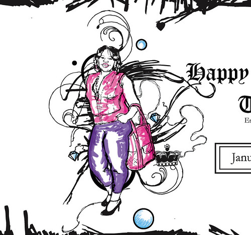
The third collage for the second volume of my zine, Man's Tendency to Sin, PrideAnd of course I'm not sure if I'm done.
Medium: Handmade & digital collage
Monday, June 13, 2011

I be Collage'in


Finally getting down to doing some personal work, feels good! In total I've started 3 personal projects and got an email to do a freelance.

I'm working on some collage work and here's the start of the first one, "Sloth". I'm mostly a by hand kind of person, but I decided to do this on Photoshop for the mere fact I don't know how to make spider webs/cob webs by hand. I'm new at using Photoshop to do things like this but it does look good; it has a painted feel to it.

Anyway comments and advice would be greatly appreciated since I'm out of my element.

Friday, December 4, 2009

Binary Opposition Postcards

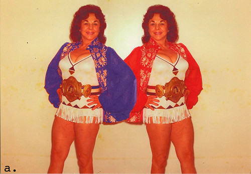
Postcard A: CYM
An assignment for my Elec Pre-Press class. Exploration of how the printing process itself can contribute to the meaning of your design and to understand “binary oppositions”.

My postcard represents my hometown of Houston,TX and the division between Southside Houston (woman in red) and Northside Houston (woman in blue).
And my love for vintage female wrestler pictures.


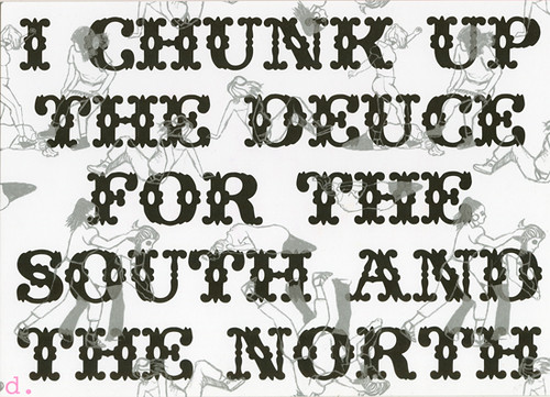
Postcard B: CYMK
Black Layer: Lyrics from "Chunk up the Deuce" by: Lil Keke (Houston based rapper) represents the fact that we're all pride about being from Houston.


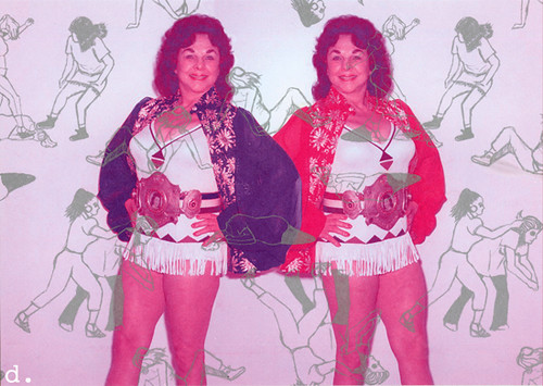
Postcard C: CYMK + Pantone
Silver Layer: Just cause I could I made a textile of a bunch of gang girl fights
(C. Silver layer will interact with all 4 layers separately. This layer can conceptually relate to your previous concept, or completely ignore it. This layer is primarily for formal exploration and will be hard to visualize before we actually see it on press)


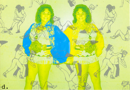
Surprise prints! Seeing what happens when we turn off the different plates

Postcard: Random (CM + Pantone)

Postcard: Random (YM + Pantone)

Postcard: Random (K + Pantone)

If you would like some please let me know. You can see more on my Flickr page as well.

Monday, November 30, 2009

@ Spyhouse

Spyhouse Illustration-One on Display

Assignment for my Digital Illustration class.

An illustration that represents a Spyhouse Coffee Shop experience.

Go check it out!! It's at the Spyhouse Coffee Shop @ 2451 NICOLLET AVE S (I think it's up til the 4th)

Sunday, November 8, 2009

Me and the digital drawing world

I’m taking Digital Illustration this semester with the renowned James O’ Brien. A really great teacher and a really nice class. As we all know I have said before I don’t like Digital Illustration work, I am a lover of putting pen to paper, but I’m all about giving things try. But I do still stand behind the main reason I don’t care for Digital. IT GIVES YOU TO MANY CHOICES!!!

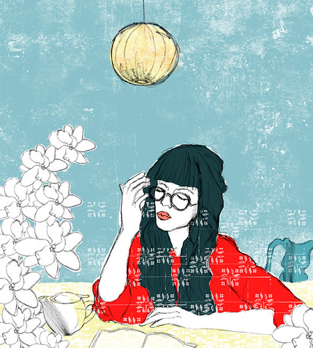
Spyhouse Digital Illustration- Orginal
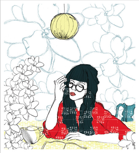
Spyhouse Digital Illustration- Cyan, Magenta & Black
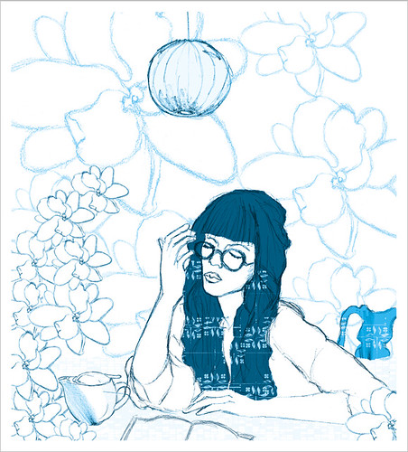
Spyhouse Digital Illustration-Cyan
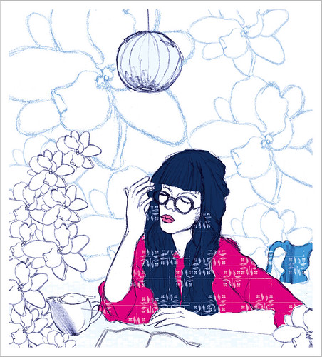
Spyhouse Digital Illustration- Black

SOME STILL ASK, THEN WHY ARE YOU TAKING THIS CLASS?

Some reasons for taking this class is:
1. my long disliking for Digital Work
2. anything that can help me step up my craft, I’m all for
3. learning something new
4. getting a better understanding and an appreciation for it

Friday, September 11, 2009

One of my Dream Shoes

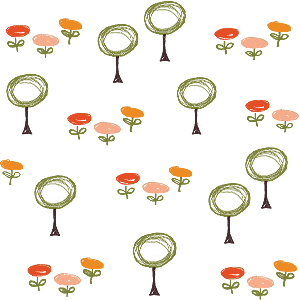
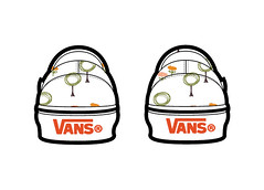
Trees and Flower Textile
Sometime ago I did this pattern for a kids back to school product line. It’s really not my style but I really like this textile a lot.

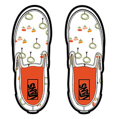
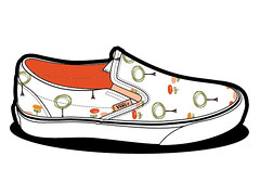
So I wanted to see how the textile would look on a pair of Vans since I’ve been looking for some but not liking any I’ve found.
Vans with textile pattern (above view)

Vans with textile pattern (side view)

Vans with textile pattern (back view)

Thursday, June 4, 2009

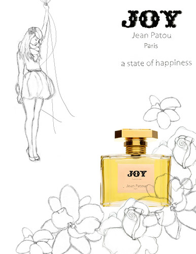
Jean Patou’s Joy

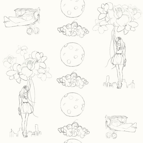
Joy Textile

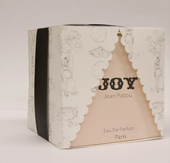
Joy Perfume packaging

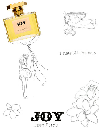
A project for Illustration 2 (now known as Concepts + Metaphors). A packaging redesign of Jean Patou's Joy perfume, which is considered the most expensive commercial perfume you can buy. For my redesign I wanted to gear the perfume to a younger crowd, so I thought more fashion editorial. I took one of the definitions of the word Joy (4. a state of happiness or felicity) and made is into a textile.

Joy Print Ad/ Store Sign 2

Joy Print Ad/ Store Sign
Later I added this print work that could be used as ads or the signs in the stores.

Friday, February 13, 2009

Customized Bottle Labels (The Process)

I got an email in late January (sorry I’m just now posting it) from a chick name Tia, who saw my orange soda bottle labels & wanted me to make some customized bottle labels for her, her cousin & their friend's Glitz & Glam Party.

I screen shot some of my process as I went along….


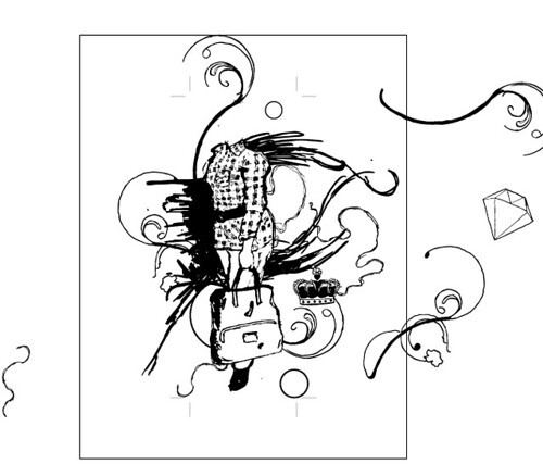
I hand drew all the elements, & put them in Illustrator. Kinda mad because I lost some details when I vectored the images.
Bottle Label Illustration
*She doesn’t have a head cause I really couldn’t see her face details in the pictures that were given to me so I had to draw those later.


Bottle Label Design Layout
Started adding in text. The colors at the bottom are the colors for the party.


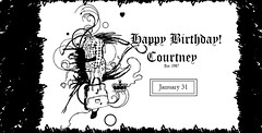
Bottle Label Design Layout
The layout of the almost finished label. Yes I did do those scribbles.


Bottle Label Illustration
I colored them digitally (you can tell I’m still not good at that, but I use very little color anyway).

Sorry no images of the labels on the bottles I will post those when I can.

Thursday, November 27, 2008

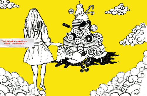
Treat Yourself to Something

HAPPY TURKEY DAY!!!

A new illustration I did while looking at a fortune cookie ticket (quote: "Treat Yourself to something of quality. You deserve it.") and listen to the Big Rock Candy Mountain song.

I usually don't do illustrations using the computer (just the background is digital, the drawings are ink). The computer gives me too many choices. So I have a problem with making up my mind.

Which one looks good?

yellow-scene

dot-scene-without-yellow

dot-scene

Wednesday, November 5, 2008

Dear Mr. President Exhibition

Voting is over and OBAMA regions supreme!!!

This semester we had a school wide project called "Dear Mr. President". The objective was to write a letter to the next President of the Free World. (Please note this project was due in September)

Anyway it's on display at MCAD right now (open Oct 31) and will be taken down November 12th, and mailed to the White House.

This is mine


Wednesday, May 14, 2008

Textiles

For my Illustration and Product Final I did a stationary line based on my Giraffe, Antonio Juan Esquivel (a third identity, part of my “Damn Giraffe” brand. A more Japanese cute inspired) based around “Alice in Wonderland”. The stationary line has a schedule/Planner, To Do list pad, Pencil Case, Tote bag, and a Note Book.

These are some textiles I made for my Illustration and Product Final.

Sunday, October 28, 2007

Do a Randy!


A project for my History of Advertising class, a salute to Paul Rand. I really love the simplicity oh his work.

Sunday, August 19, 2007

HELLO SWEETIE contest entry


This is my entry to the Hello Sweetie Illustrated Dessert Contest. Basically the rules were you had to illustrated a dessert along with the recipe using pink, white, grey, and black. The recipe I selected was Strawberry Wontons, a recipe my roommate Dolly Vu showed me how to make.

Monday, July 30, 2007

Unifinished Illustration


This is an illustration that I just started on using Adobe Illustrator. MY FIRST!! YEAH!! A goal of mine this summer, to learn how to use illustrator (well at least better than I do now). This illustration is from “Alice in Wonderland”, when Alice falls down the rabbit hole.

Saturday, May 19, 2007

Untitled Illustration Design

One of my favorite illustrations. It shows my illustration style the best. Simple, sketchy line work, white background, with color here and there.


I use this illustration in many design applications, here are two.
Stamps


iPod body sticker